‘t Landhuis Communal center
Client
Municipality of AmsterdamFloor area
550 m² GFALocation
AmsterdamPurpose
Youth center and after-school childcareStatus
DeliveredProject type
RenovationYear
2013 – 2014Assignment
Competition
This project was initiated in cooperation with the residents of the Landlust neighborhood. As an alliance, our preliminary design won the competition for the renovation of the existing youth center ‘New Society’. We then worked together with the relevant stakeholders to further develop the design.
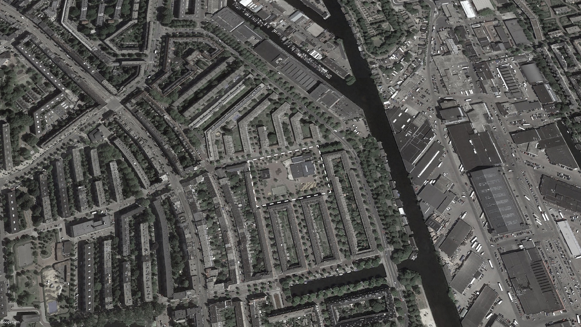
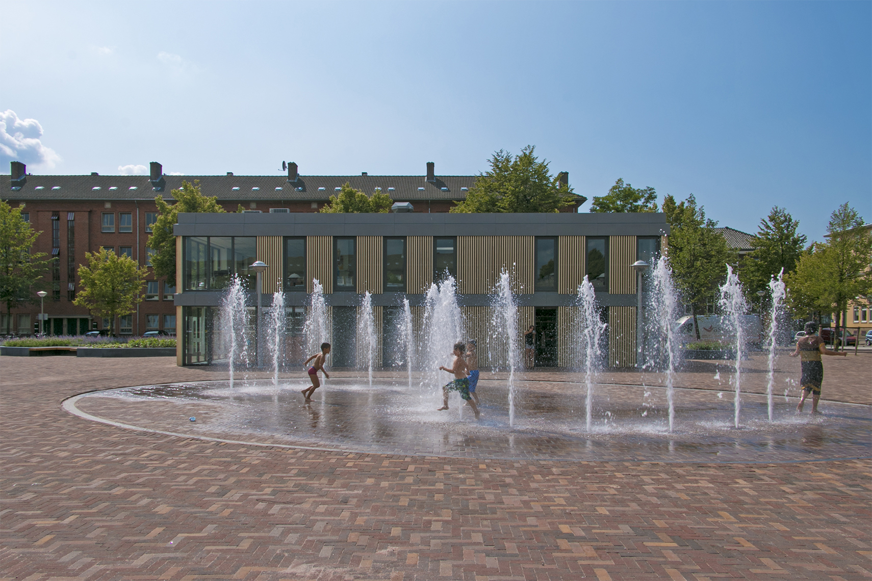
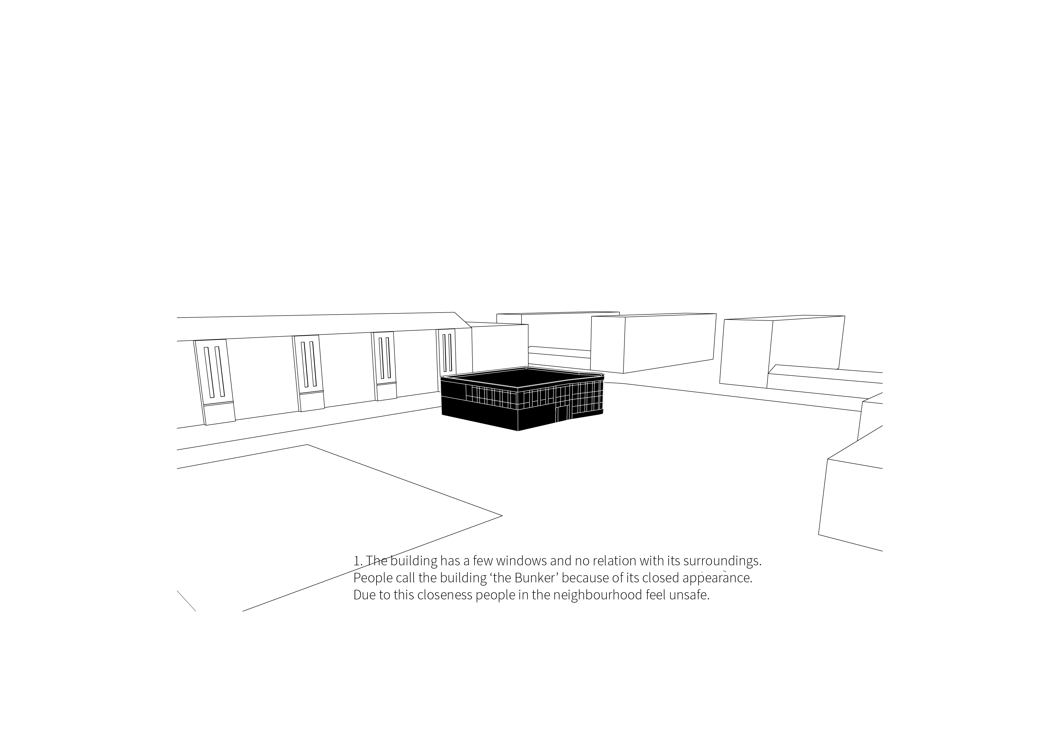
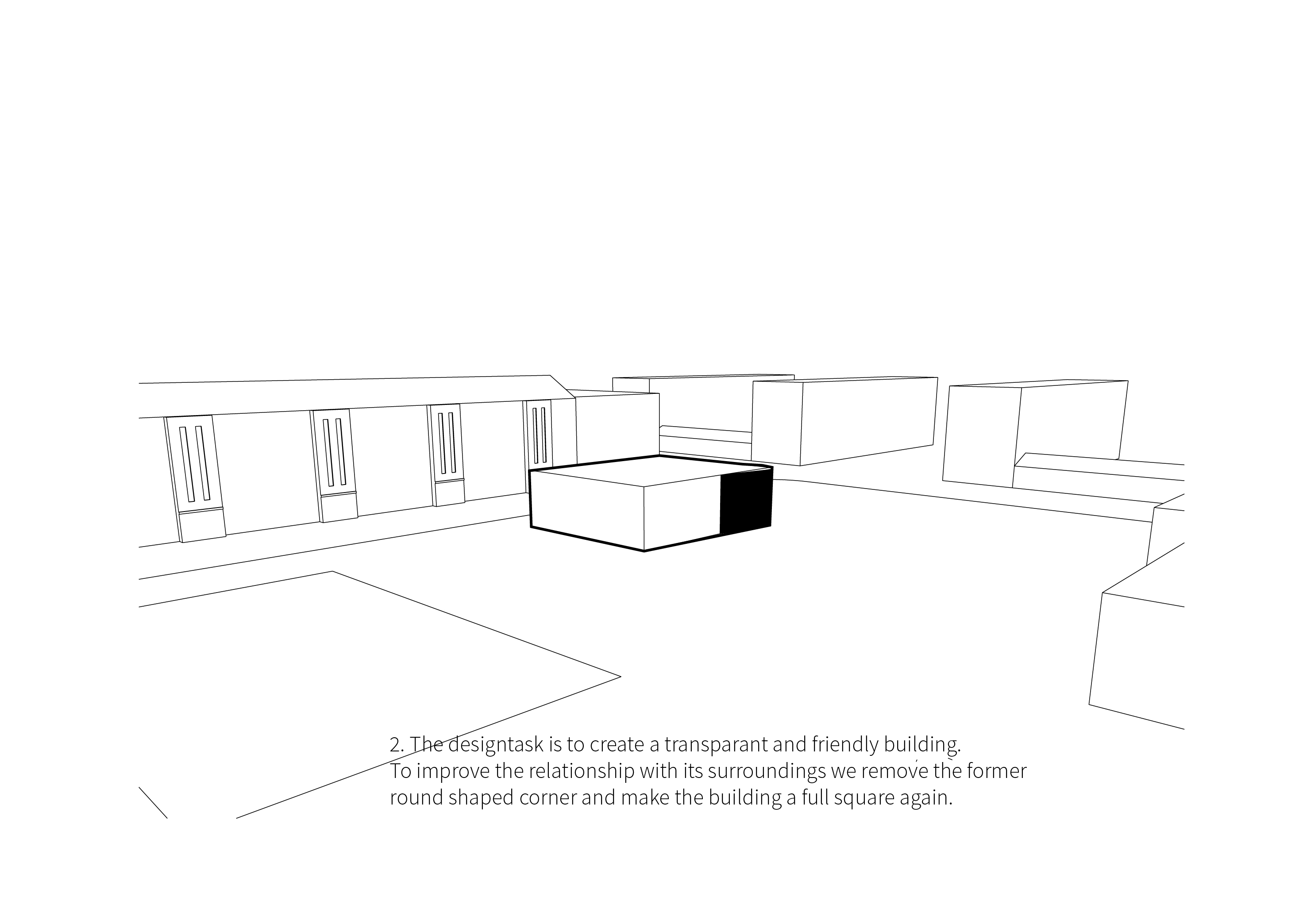
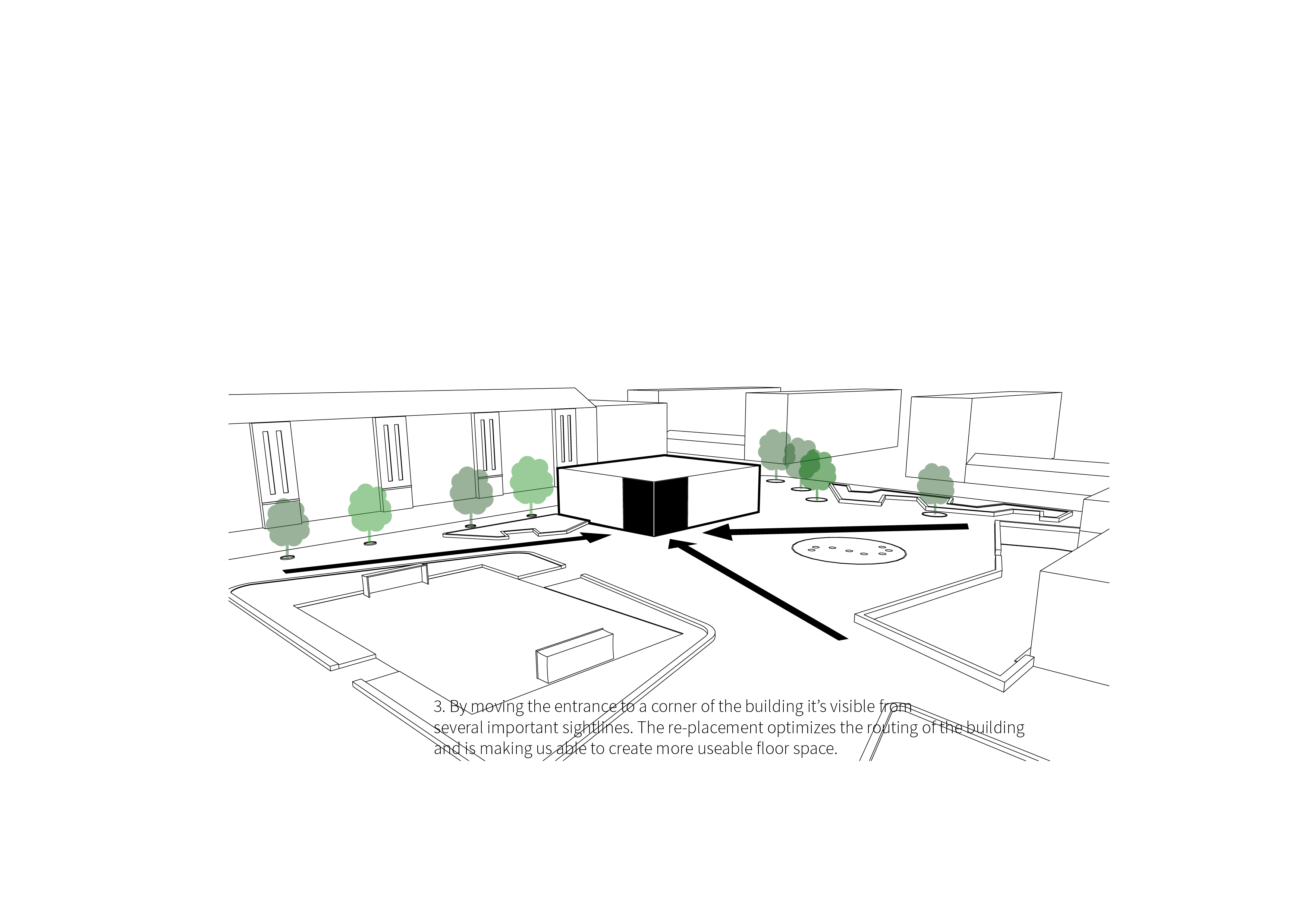
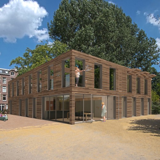
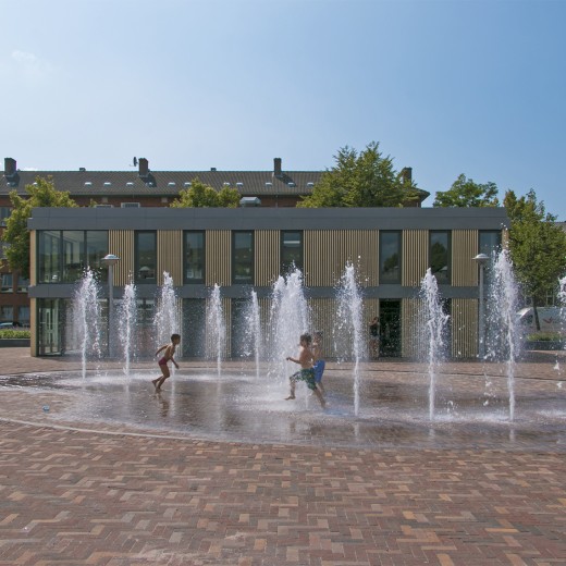
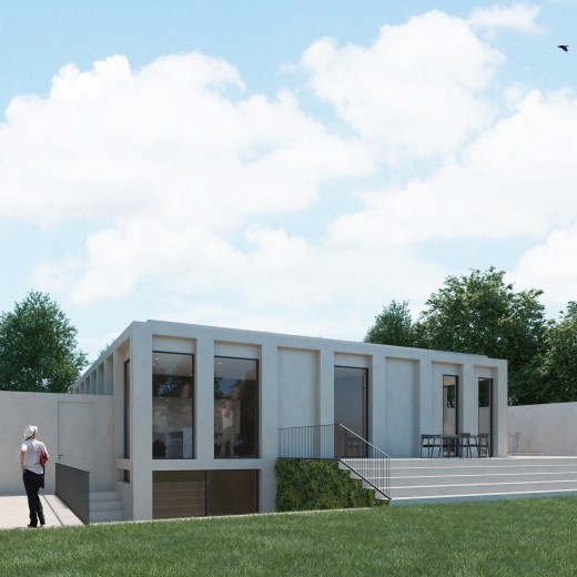
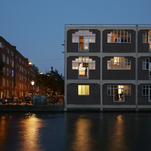
The goal of the renovation was to make the building more transparent and to give it a friendlier, more welcoming look. The existing building was referred to as ‘the bunker’ by members of the community due to its closed-off character. The interior of the building was barely visible from the outside and the visibility in the surrounding square was low, making it an attractive place for loitering by young people, which made the local residents uneasy.
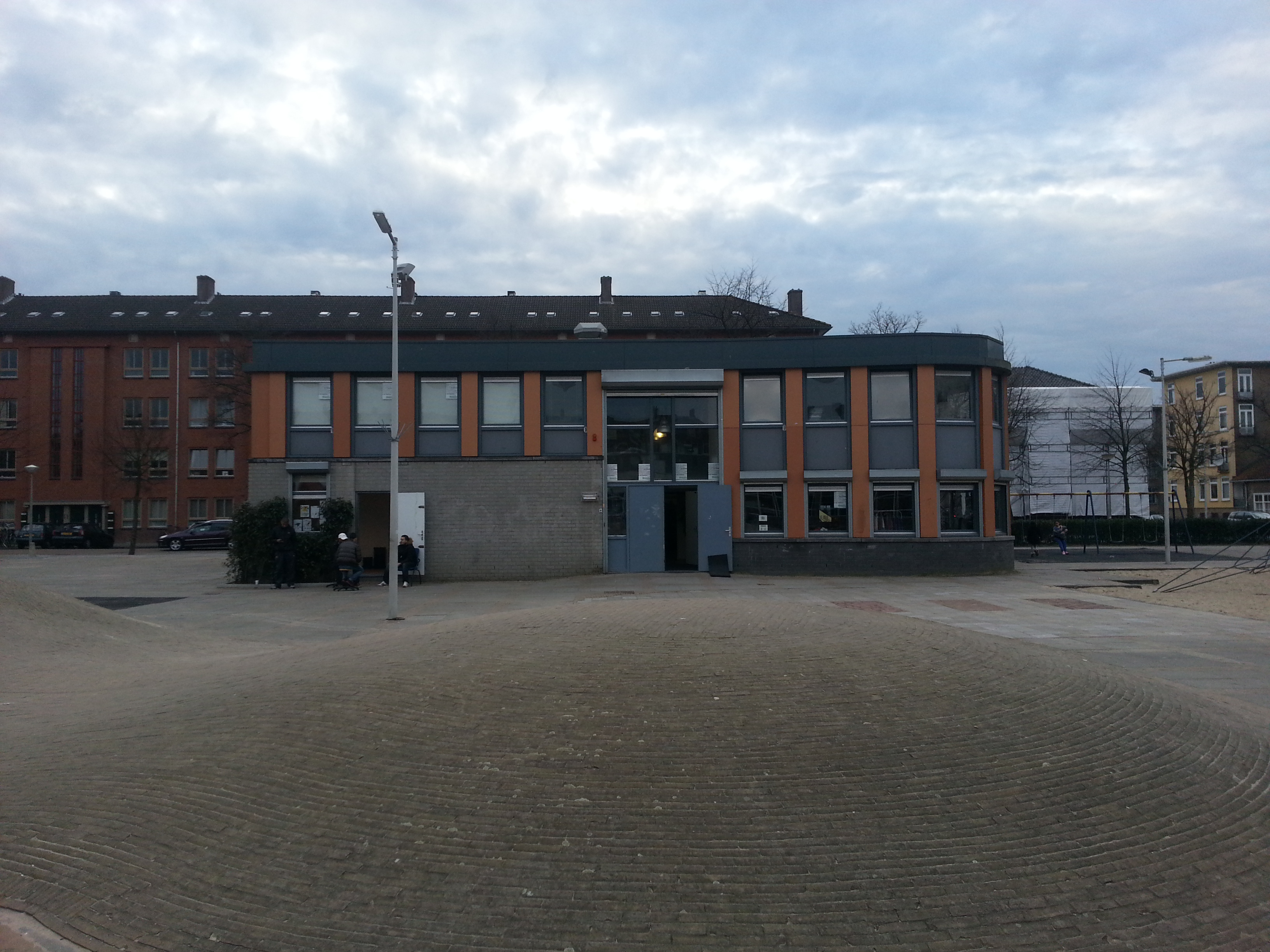
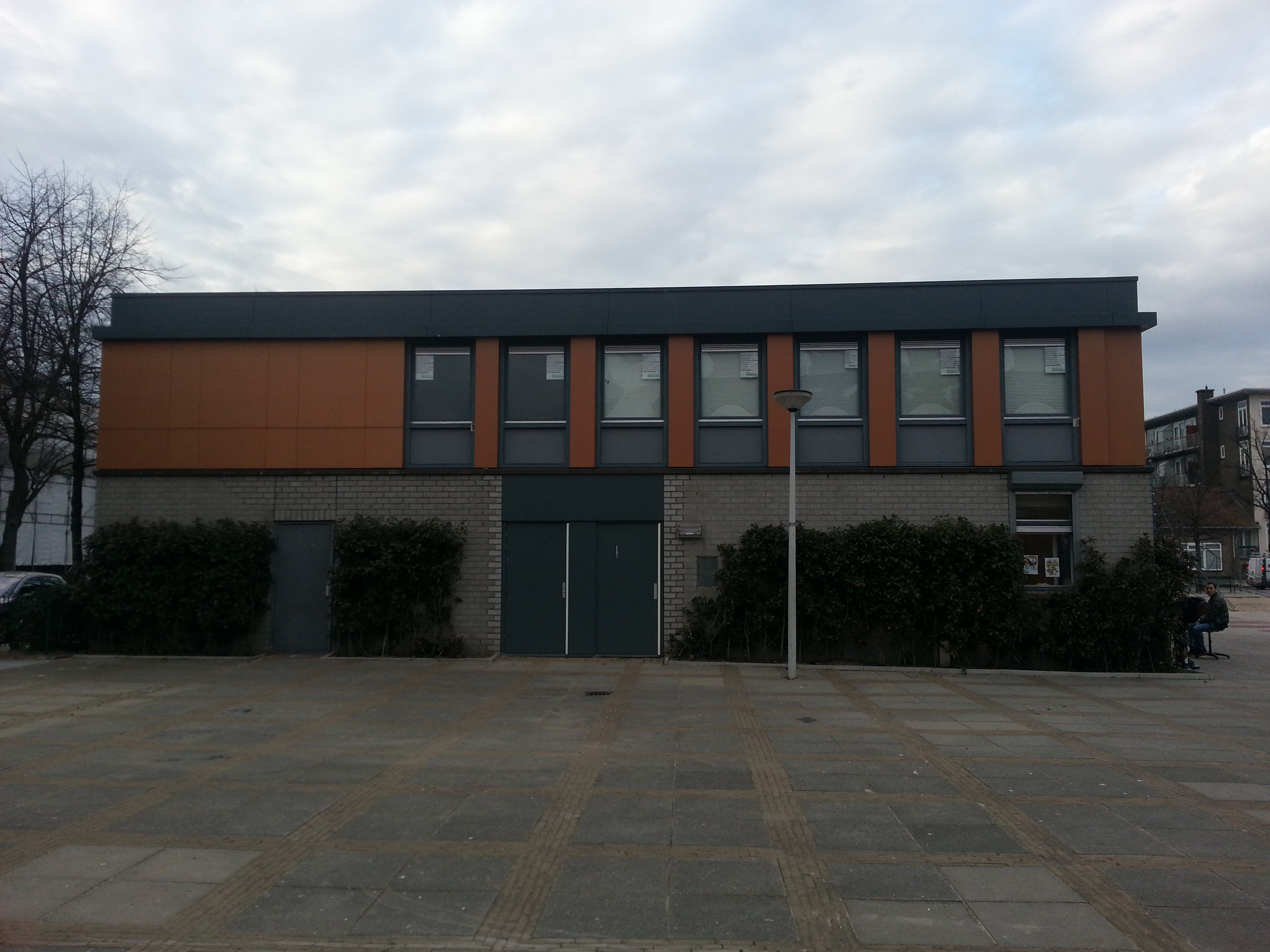
“The building was known as ‘the bunker’ because the exterior of the building was almost completely closed off.”
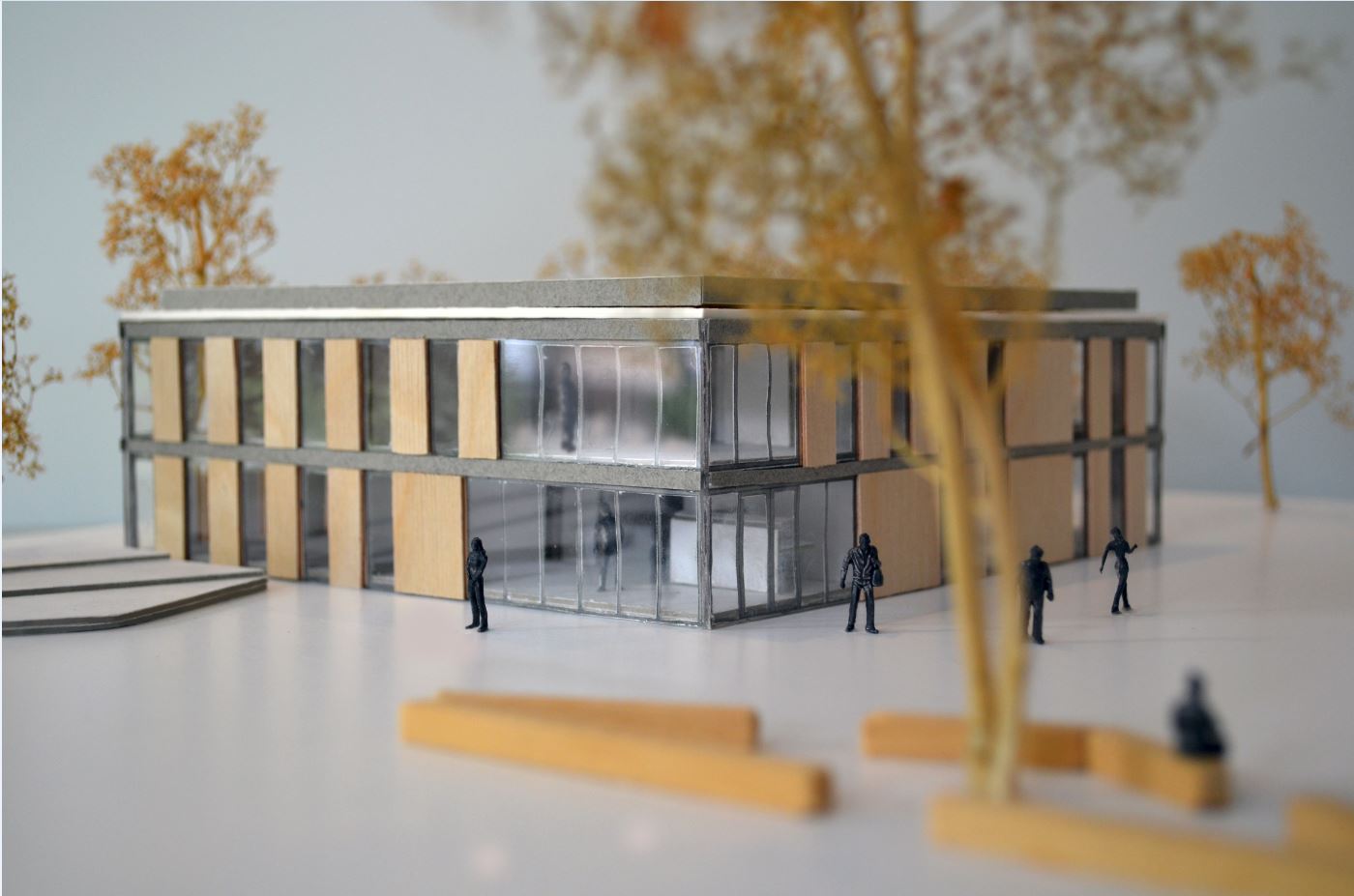
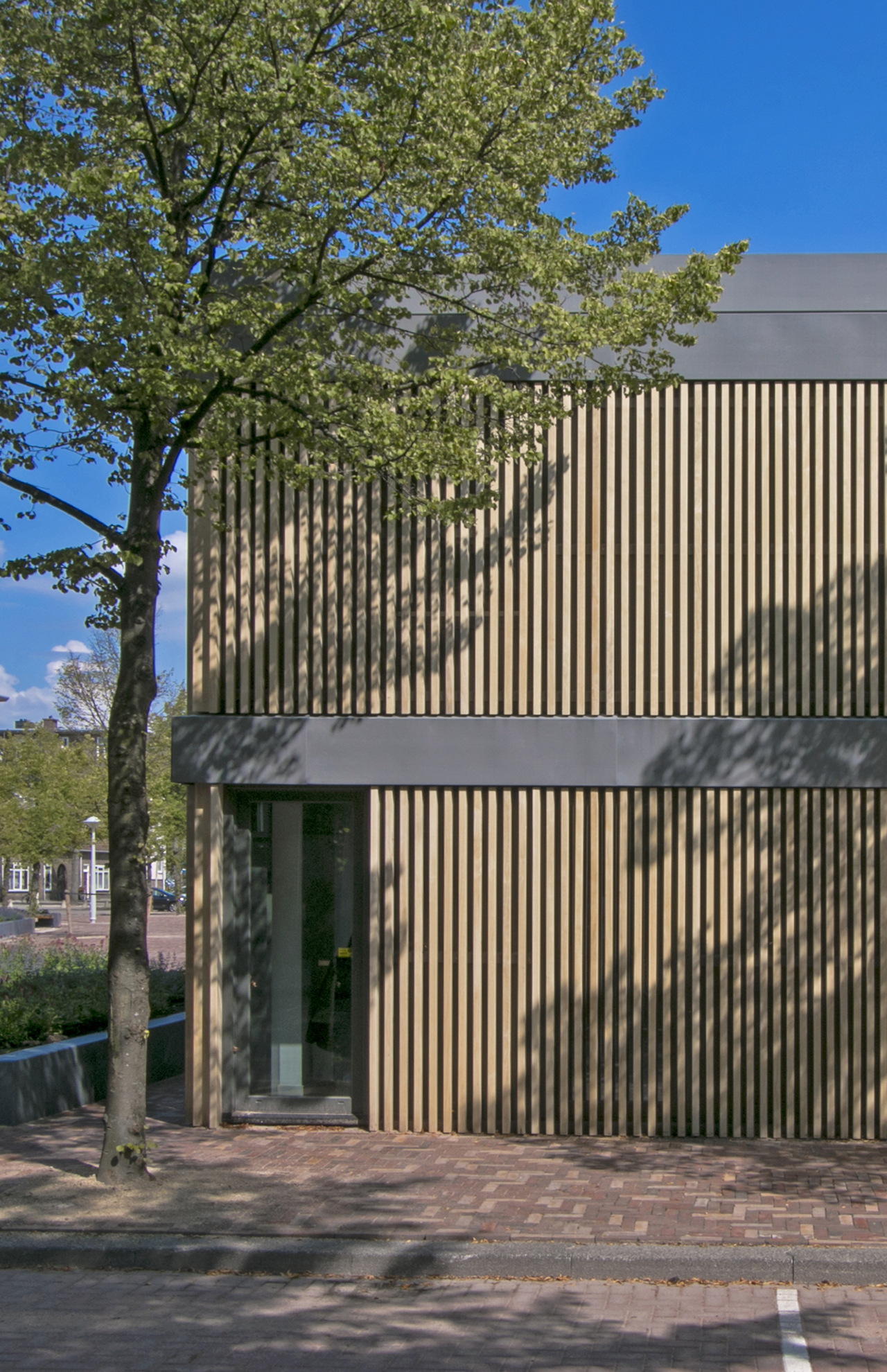
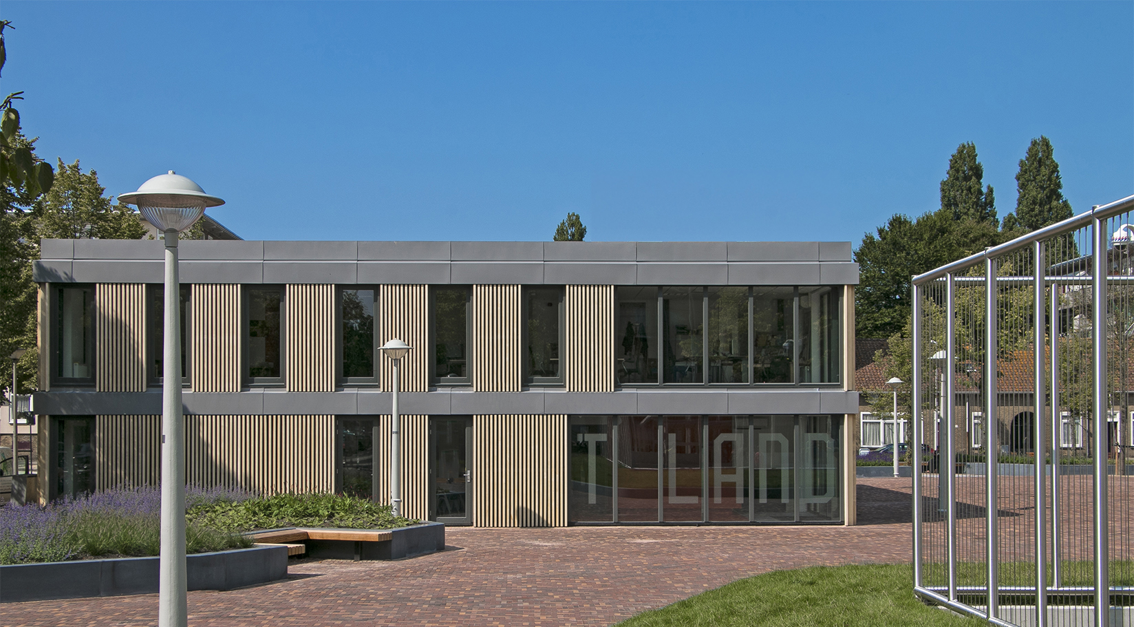
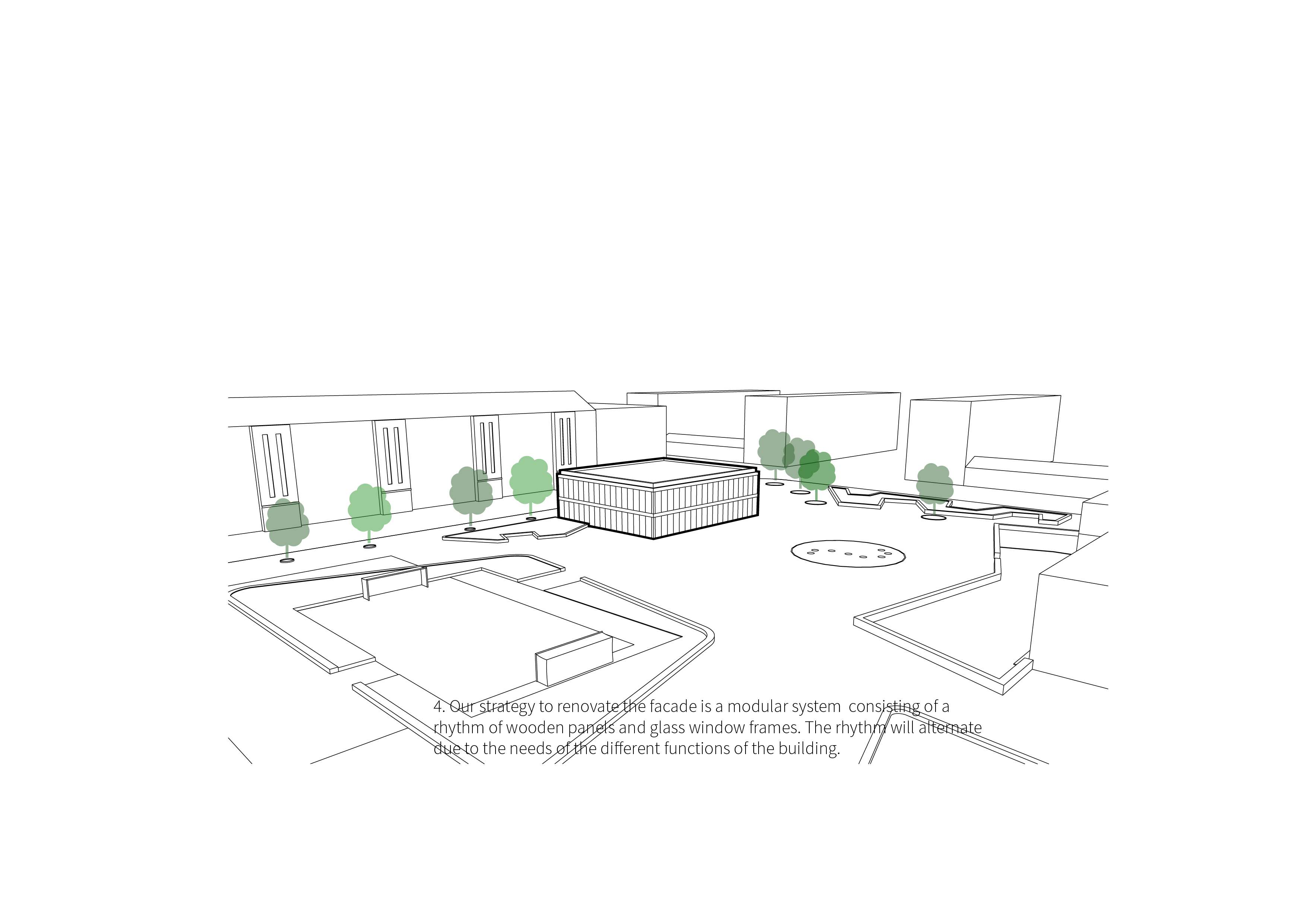
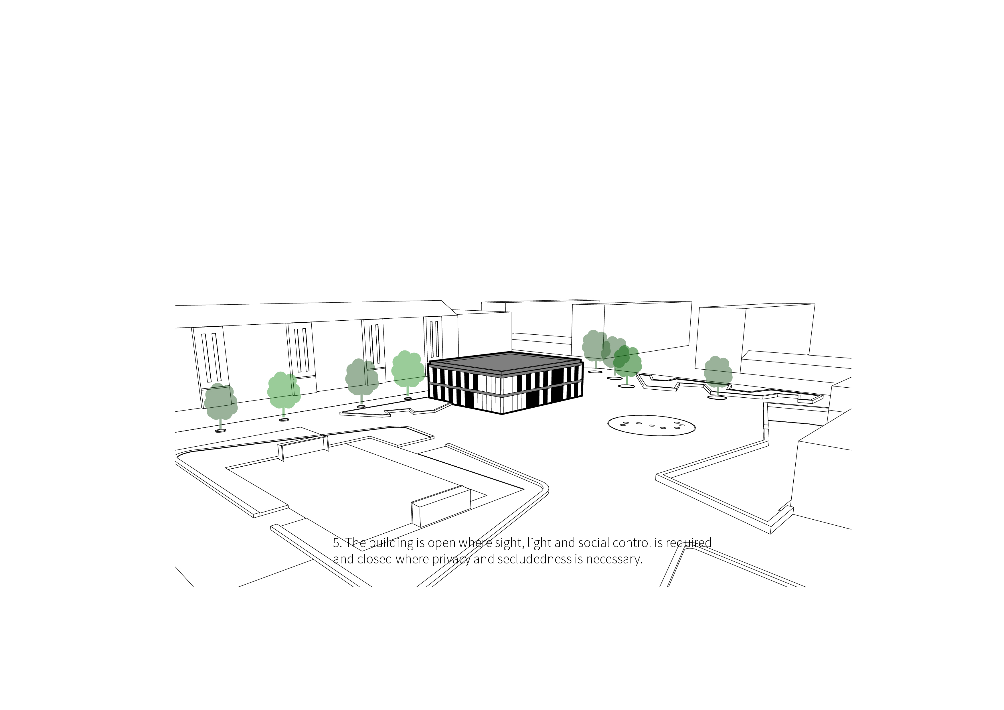
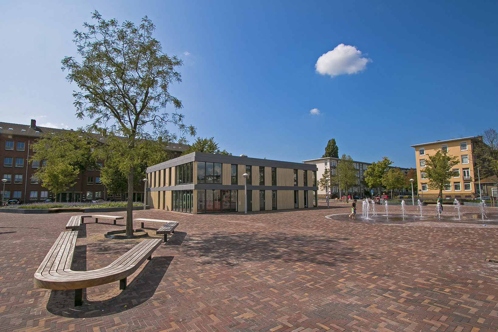
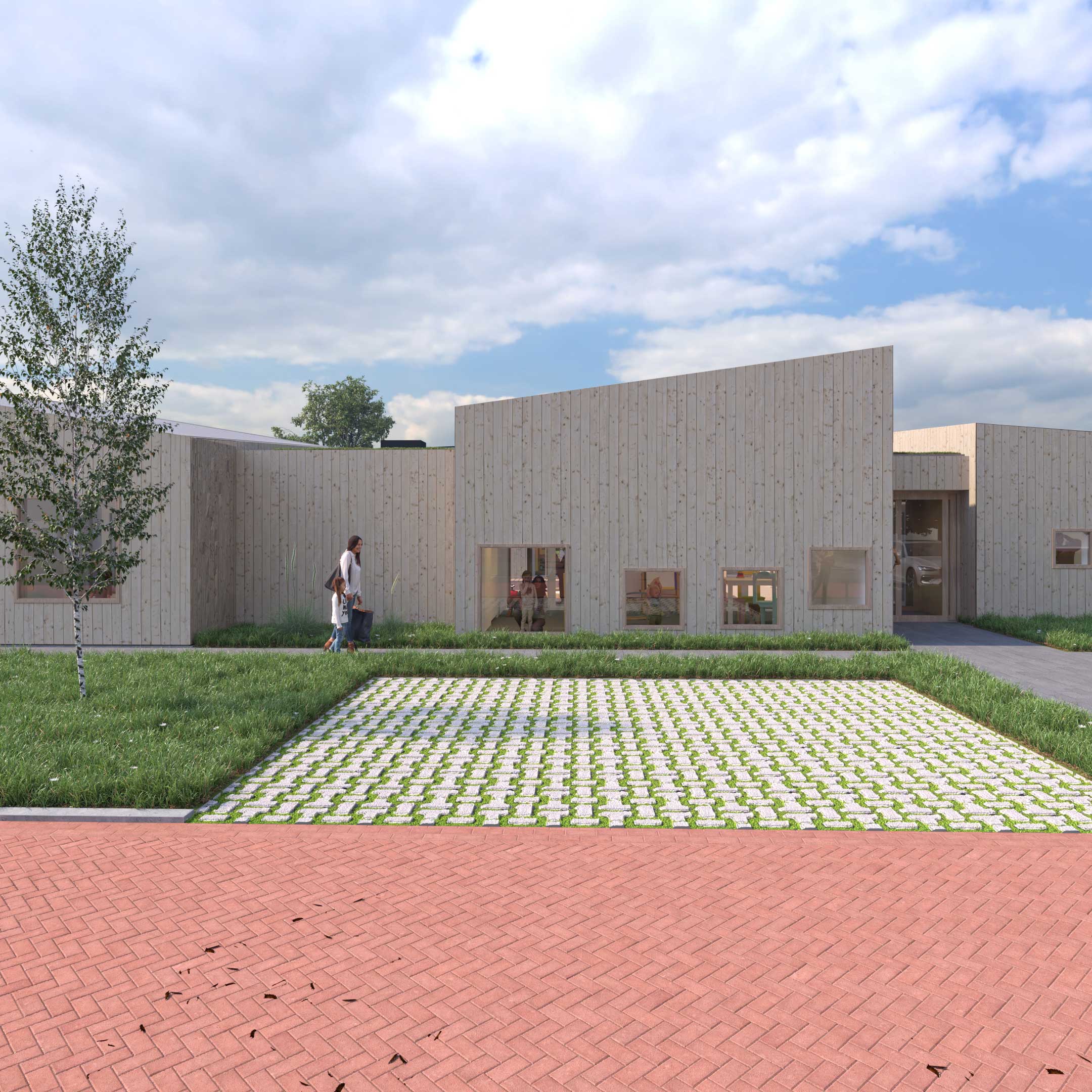
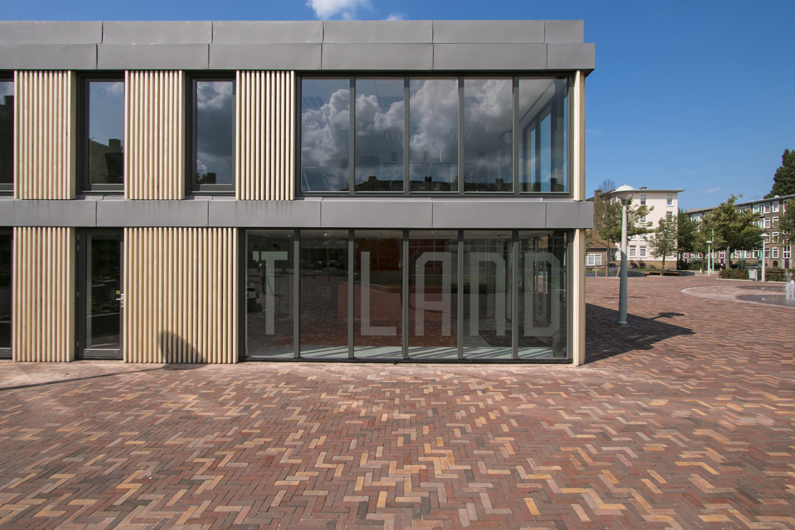
The new exterior consists of a rhythmic pattern of open glass sections and closed sections made up of Accoya wood elements. The façade includes large closed areas where needed and is more open in areas in which sight, light and social control are necessary. The rhythmic nature of the use of open and closed sections is apparent throughout and provides the basis of the detailing on the wooden elements and the corners. In several areas, vertical Accoya posts transect the glass, creating a layered and visually exciting look while maintaining light and visibility.
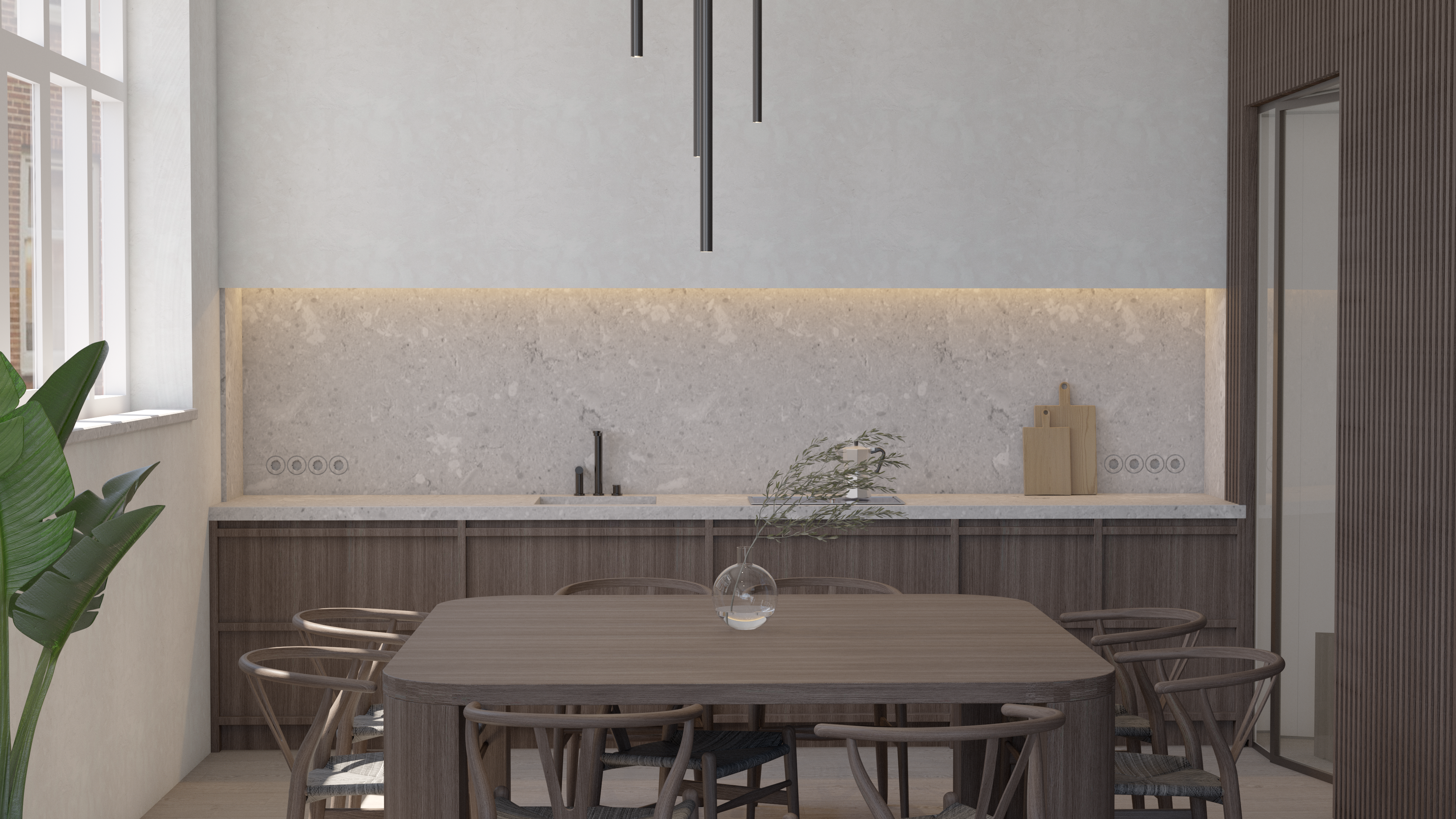
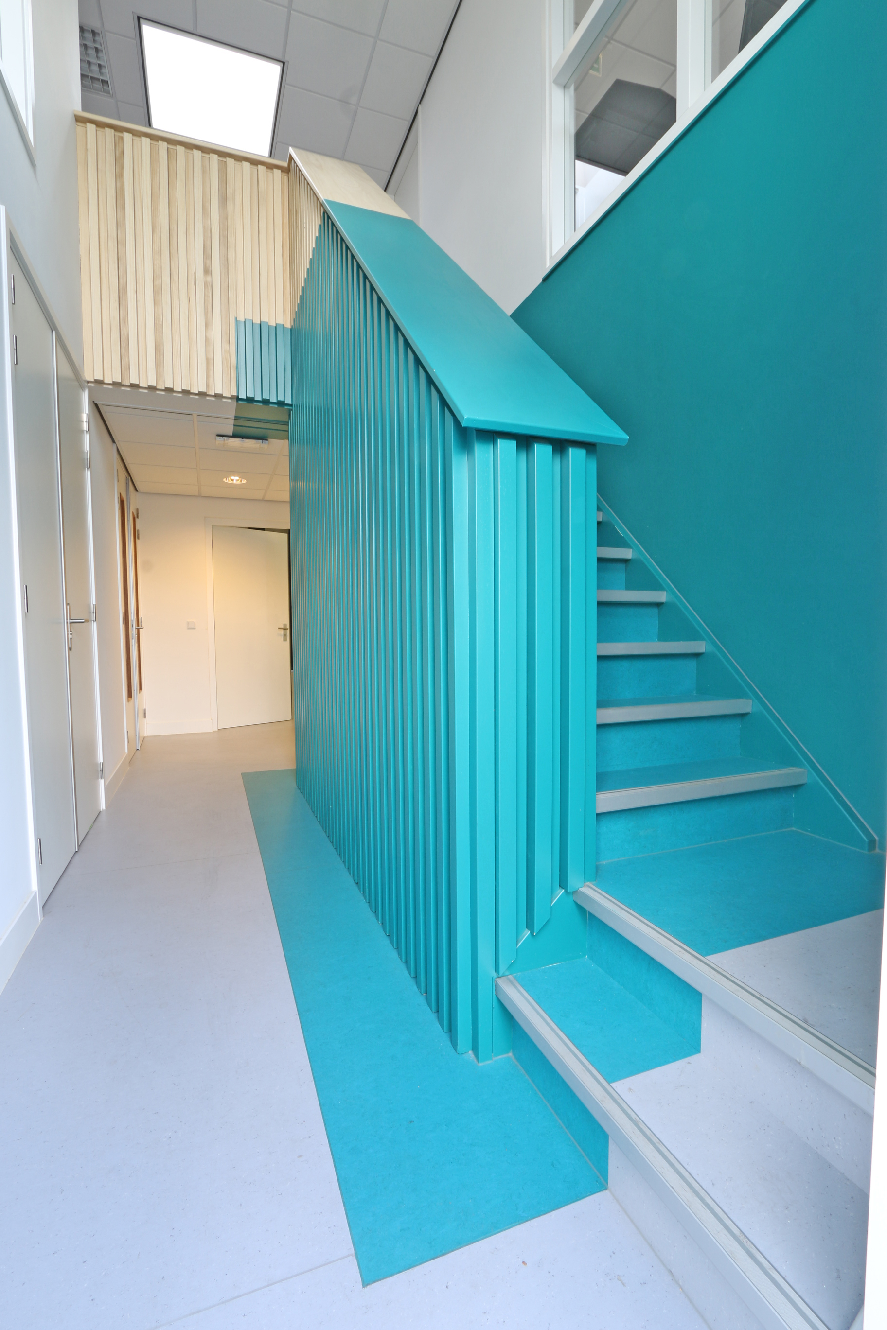
The interior design we created includes of a variety of specially designed pieces of furniture, which make a bold statement both inside and out. In places where an item of furniture is situated, we worked with patches of color. These robust patches are included on furniture, floors and various spots on the ceiling.
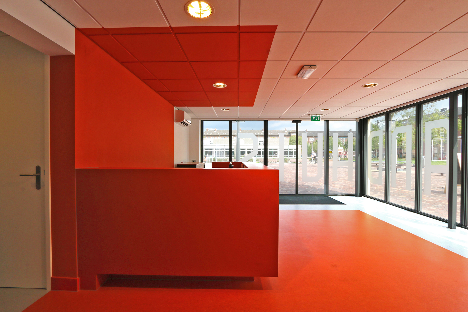
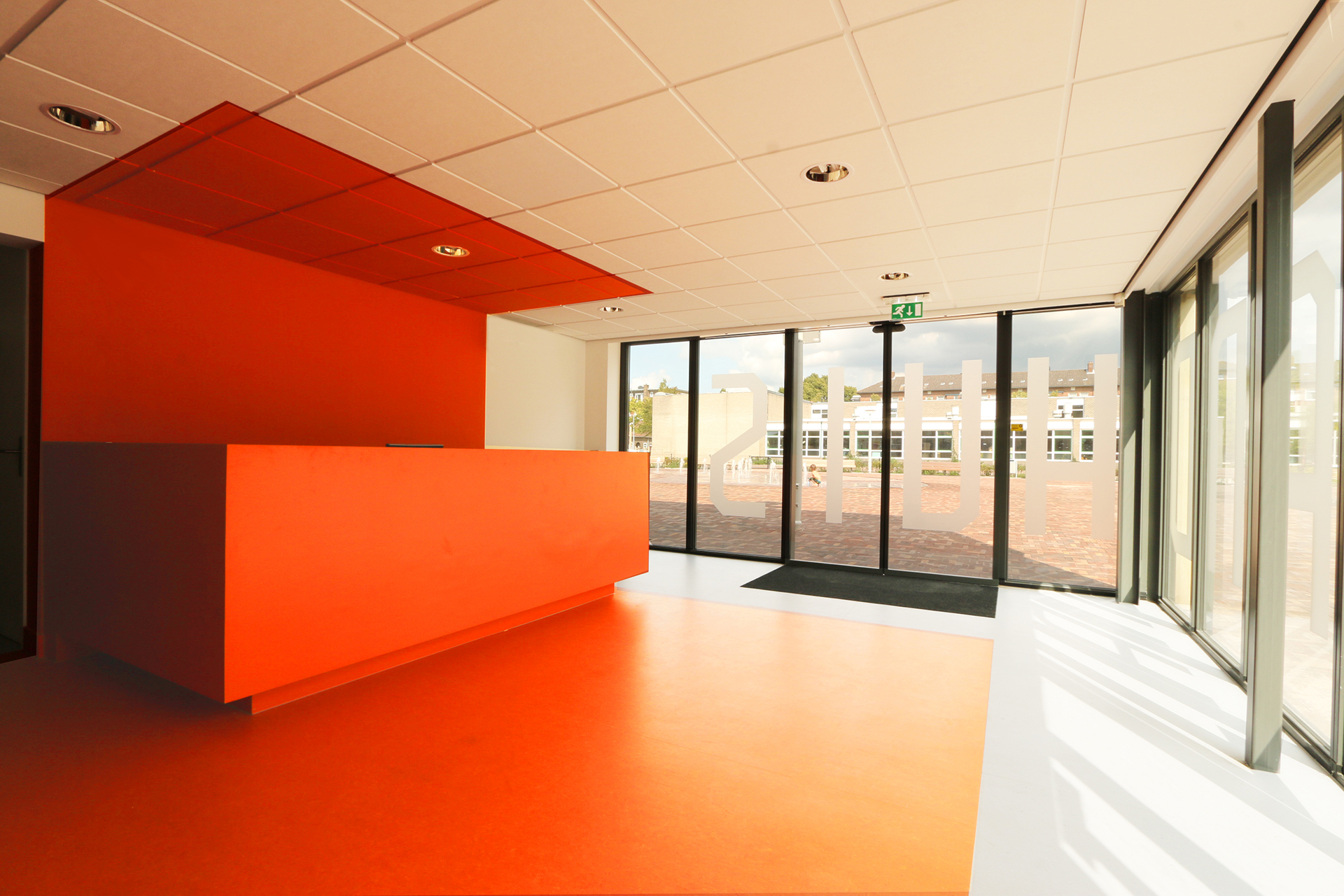
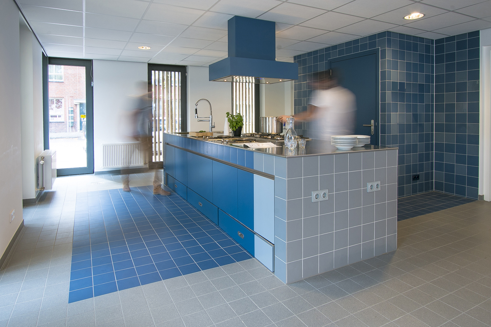
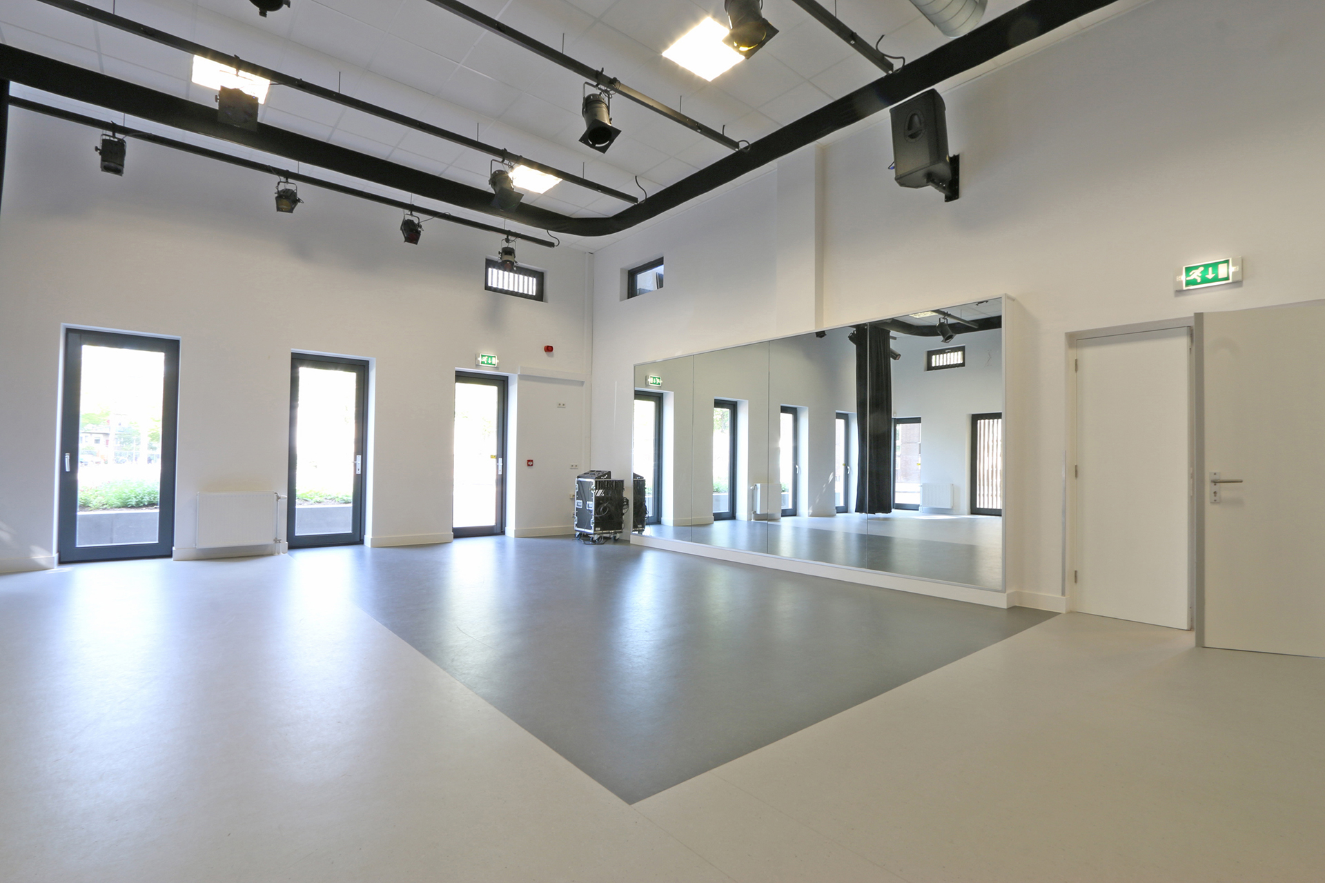
“Patches of color highlight the fixed furniture.”
The name of the community center, ‘t Landhuis, was selected on the basis of a competition. We worked together with Studio Hoope to create a graphic design and typography for the name of the building.

Credits
Team:
Roy Plevier, Jos Hoope, Kees Hoope, Tugce Kaynak.
Tags:
Jeugdcentrum, prijsvraag, gebiedsrenovatie, participatietraject, renovatie, interieur, >500 m², Amsterdam, Nederland

